Hidden Gems
Designing an event app that allows travelers to connect with locals to experience hidden local gems.
Project Overview
Academic Case Study ⸱ Fall 2024
For the duration of one semester, my team and I developed an end-to-end design solution to solve a common issue we faced when traveling: feeling like an outsider as a tourist. The purpose of this project was to undertake a comprehensive UX design process for the first time through co-creation, user research, iterative wireframing, prototyping, and user testing.
Problem
Many travelers struggle to find authentic experiences of a place when visiting, leaving them to opt for more formal, organized activities that alienate them from local culture. They feel dissatisfied with the filtered experience that a tourist typically receives.
Solution
Hidden Gems helps travelers gain an immersive local experience of a place by connecting them with local people who can share their insider perspectives through an informal, small-group activity.
Role:
Team leader & Task Coordinator, Presenter
Research, Wireframe & Prototyping, Usability Testing, UI & Graphic Design
Group Members:
Tansu Demir, Erez Zobary, Lauren Suna, Quanru Ji, Jennifer Ayow
Tools:
Figma, Zoom transcription, Adobe Photoshop
How can we help travelers who are tired of the mass-produced and expensive tourist attraction experience, discover a place so that they can feel an authentic connection, and learn about others’ cultures?
Secondary Research Insights
Our background research focused on understanding authentic and meaningful travel experiences. I focused on finding research insights that explored:
What defines an authentic travel experience?
What makes an experience meaningful and memorable?
01
Authenticity can be defined as realness, uniqueness, and organic-ness.
02
Value is gained when one participates/ invests themselves in an experience through time or energy.
03
Memorable moments are comprised of ‘Peaks’ associated with surprise, delight, and excitement.
Opportunities
We evaluated relevant competitors for gaps and opportunities to help us understand different approaches in connecting users which I summarized in our project brief.
-
The scheduled programming and transactional setup leads to feelings of replicability and formality.
-
Competitors that focus on connecting strangers create an unconscious high-stakes expectation that the activity or relationship should develop further (Eg. Bumble BFF there is pressure to become friends).
-
Rather than an experience that feels like a mass-manufactured tour group or a high-stakes relationship-building app.
01 Discovering the Problem
During Phase 1, we scoped out the travel problem space and a traveler’s needs. Our project and research were guided by the following key question:
02 Focusing the Scope
During Phase 2, we did research interviews which focused the scope of our problem to target our user group of young professionals. I helped identify participant criteria, drafted the interview questions & script, conducted user interviews, and analyzed the group’s data for key insights to inform design.
User Interviews
We conducted 2 interviews each for a total of 12 interviews. Both of my interviews were done through Zoom with transcription and lasted ~30 minutes.
Inclusion Criteria: Interview participants had to be over 18 and have access to a smartphone. They also had to have travelled in the last 2 years or hoped to travel in the next 2 years.
Key Questions:
Tell me about your best or most memorable travel experience? What made it meaningful?
What is your favorite way to fully immerse yourself and connect with a new place?
Have you ever met-up with a stranger in an unfamiliar destination to do a shared activity? How did that go?
Key Insights
Quotes with important information were simplified and grouped by similarity to find key themes across participants that could be used as insights to inform design.
“Just finding hidden spots where people go, that your general tourists might not know.”
~Participant SPI


User Persona: Young Working Professionals
Our group consolidated our interview insights into a single User that could guide our design decisions. We chose a young working professional because many of our interview participants were in this demographic and their lack of money/time made them a good group to design a smaller, more local travel experience for. Other services were already available for those with higher budget and international travel abilities.

“Being able to experience learning about something new, whether it's like a new culture or language, the country itself.”
~Participant PLB

03 Solution Ideation
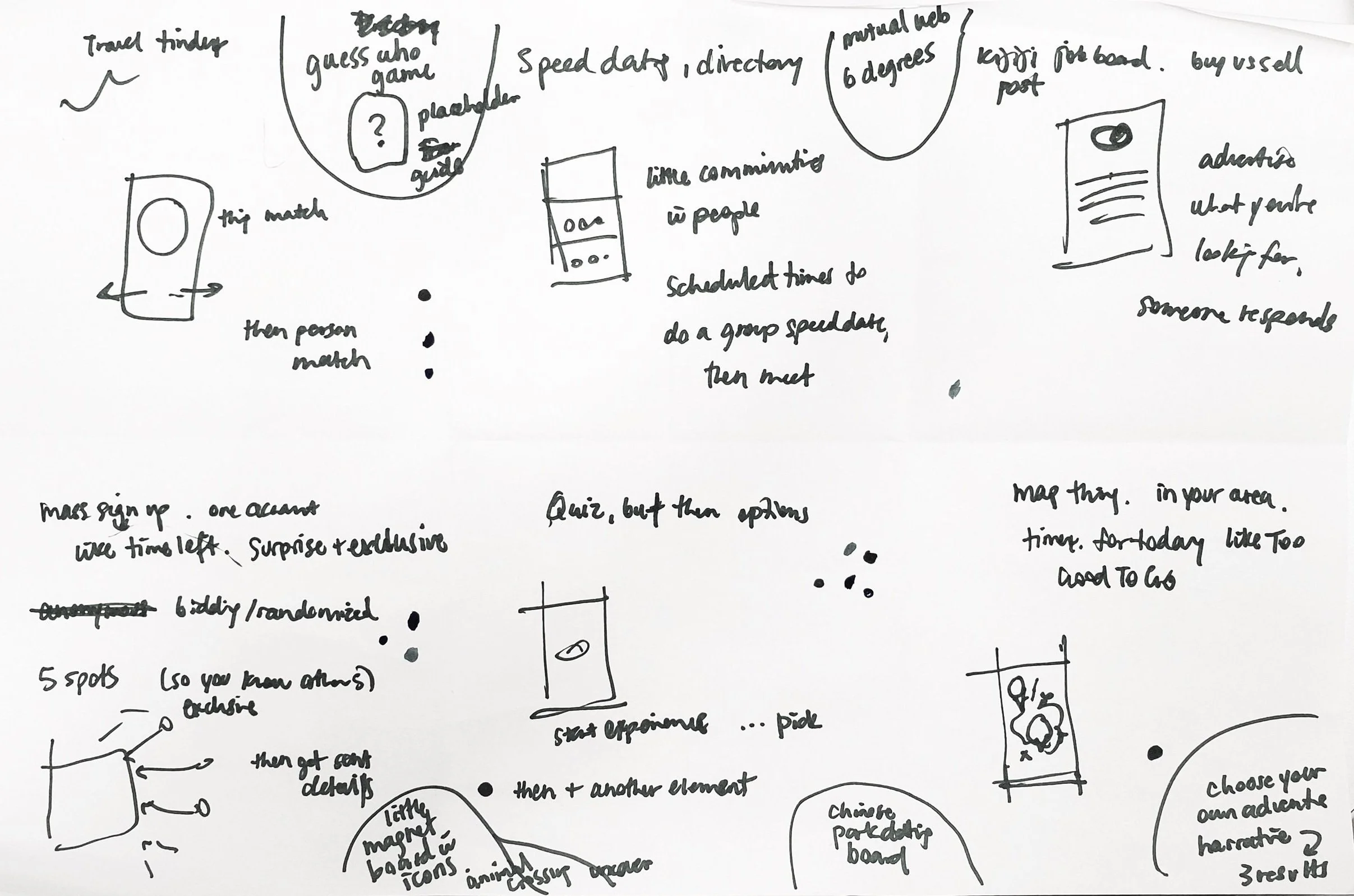
I did 2 rounds of fast ideation, jotting down 6 different solutions on paper. Some big ideas on how to connect travelers & locals were:
Activity Tinder
Kijiji job board - but posting/finding a person or activity
Timeleft mystery group but for activities
Buzzfeed quiz but for finding your perfect activity
Animal Crossing virtual exploration of a real place
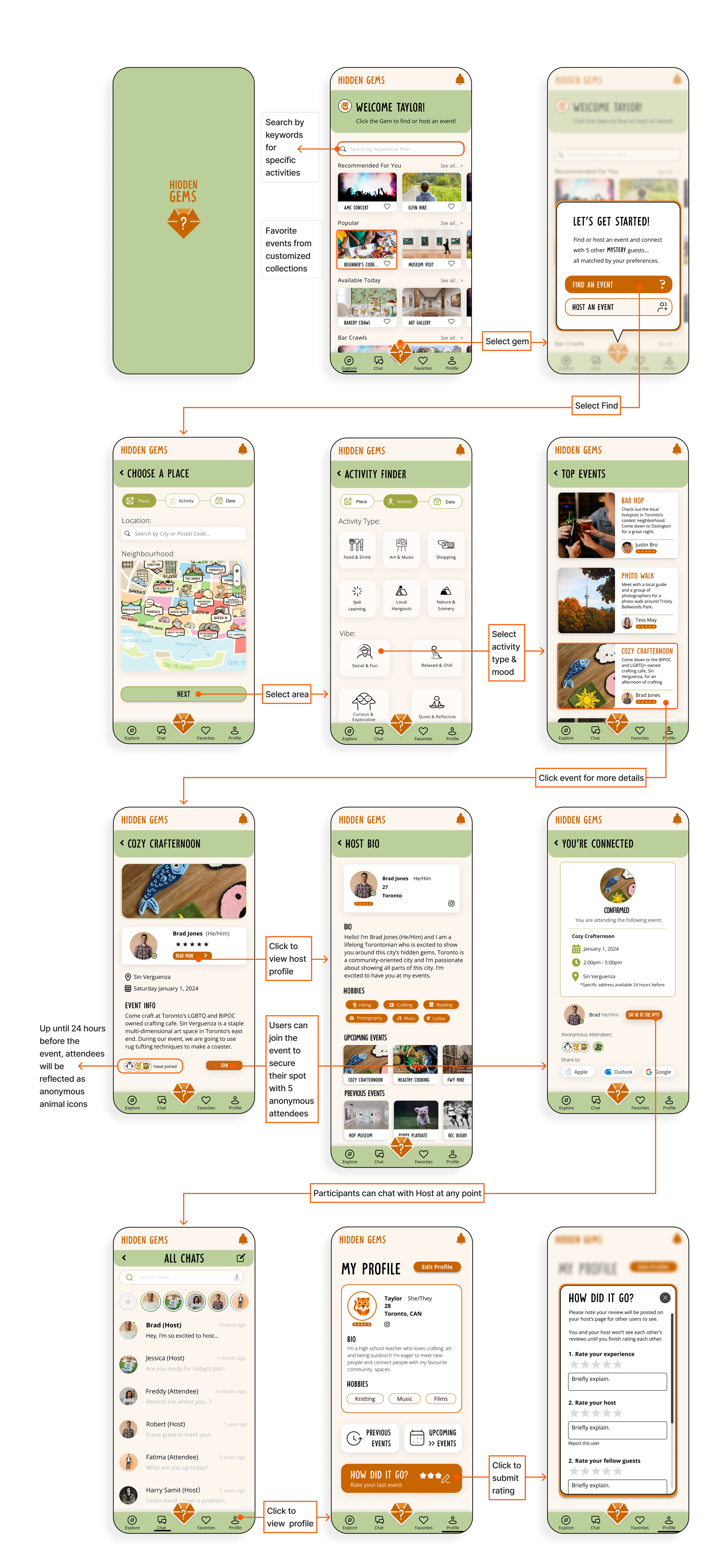
Solution: Wireframes & Task Flow
Finding and Joining an Event (as a Traveler)
I sketched out different ideas for initial User Interface (UI) screens when a user tries to join an event. The main components were: the initial Join/Host screen, the Selections screen, and the resulting Events screen.

Screen Iterations and Refinement
These screens evolved multiple times. I thought it would be useful for ideation and individual practice, so I led our group in several cycles of quick iteration as we increased in refinement.

Brainstorming Solution: Concept Sketches
During Phase 3, we brainstormed big ideas and solutions for our problem space. I created a user flow diagram and sketched key UI screens necessary for joining an event from the app. As a group, we consolidated our ideas into one interactive wireframe which we tested on our peers. I presented the updated presentation to industry experts and received feedback.
Reminder of Problem:
Help travelers who seek authentic experiences of a place,
connect with locals who have interesting insider perspectives,
so that they can feel immersed in the culture of their destination.
We used a matrix to help focus the ideas selected. The ideas determined to be High Priority & High Feasibility were:
Exclusive mystery group experience
Algorithmic personality/activity matching
Integrated rating & feedback
Moodboard

Retro
Friendly
Exploratory
Spontaneous
Playful
I created a group Mood Board consolidated from our vision words and individual mood boards. Our peers gave us feedback that they liked the orange (friendly colour) and green (fresh and exploratory).
Style Palette
As a group, we made individual Style Tiles and voted on elements that we would keep. Jennifer’s logo and my Style Tile were combined along with a colour palette change to create the Group Style Tile below:

Resolving Homescreen and Main Buttons Issues
There were many changes to apply to the UI Screens based on Phase 3 feedback. One major change was figuring out how to make the ‘Find/Host’ buttons prominent enough yet not so large that it exceeds standard icon sizes for ease of use. The colour palette combinations were also too heavy or did not fit the playful, exploratory, spontaneous vision words. I tried many different iterations:
Round 1 focused on redesigning the ‘Find/Host’ buttons and applying the color palette. This iteration resulted in one favorite which was taken onto to another round of iterations.

Round 2 tested different card styles. I later started experimenting with font as the logo font (’Understory’) fit the playful exploratory vision better than the ‘Newsreader’ font from the Style Tile. I brought these ideas up to the group who liked Option 1E the most.

Final Task-Flow & Features
The high fidelity mock-up takes users through the most important task: finding and joining an event. The visual design is playful, and leans into the jungle exploration font and animal icons. The bottom taskbar with the Gem logo as the main button acts as the main Find/Host button but users can also find events easily on their Explore page or with the search bar function if they have specific wants.
04 Visual Design & Refinement
During Phase 4, we applied the feedback to our UI screens which we resolved in more detail. After individually creating a mood board and style tile, we decided on a shared group visual style which I applied to our mock-up screens. Erez and I presented our final group-created presentation to alumni and industry professionals.
Key Learnings
Overall, this project has taught me a lot about process. It was my first time going through the UX design phases, from user interview research on travel experiences to creating mock-ups in Figma. I learned the importance of quick sketches to capture ideas quickly and the need for detailed screen designs when testing with users. Each stage has different priorities, making the design process both complex and interesting.
I also further learned the principle of clarity and simplicity in design. During solution ideation, we chose a simpler multi-step quiz over a more complex Animal Crossing virtual world due to time and skill constraints. Identifying the user group also required simplifying our problem focus. Initially, we didn’t want to exclude anyone, but narrowing the group allowed us to design a better solution for users with shared needs.