Kyoto Gosho
Assessing a website’s information architecture & proposing a revised navigation structure & homepage
Project Overview
Academic Case Study ⸱ Fall 2024
Over a duration of 3 weeks, I performed an audit and analysis of the information architecture of the Kyoto-Gosho website which features four buildings of cultural and historical significance in Kyoto. I then gave recommendations for a website restructure and redesign.
Objectives
Assess Content Performance: Use the Screaming Frog crawler to determine site performance against key quantitative metrics.
Identify Gaps and Weaknesses: Use qualitative observation and tools such as User Journey Map to critically analyze the data and assess issues in content and information architecture from a key user’s perspective.
Propose Site Improvements: Find solutions and opportunities to improve user experience and information retrieval.
Role:
Content Inventory & Analysis of Information Architecture, Proposal for Improvements
Tools:
Screaming Frog SEO Spider, Figma
01 Background Research
First, I browsed and evaluated the site for its functions. The website features four buildings (palaces and villas) which have cultural and historical significance within Japan. It functions as both an educational resource and an online method to book a visit. Primary users include both domestic and international visitors, tourists, scholars, and anyone interested in Japanese heritage.
Japan’s Imperial Household Agency owns and administers this site and their goal is to “provide a useful reference for a large number of people who may wish to deepen their knowledge about the activities and traditions of the Imperial Family”. The goal of this site therefore can be implied to also be educational and informative. This goal is evident in the site’s frequent publication of new informational content such as new web pages, brochures, reports, etc.
Target Users
User A: Looking to Book a Visit
Domestic and international visitors
Scholars, researchers, designers

User B: Researching the Palace
Scholars, researchers, designers
Visitors wanting to learn more

02 Content Inventory
After understanding the functional requirements (priority tasks) of this website, I conducted a content inventory using Screaming Frog software. The content inventory below showcases the main break down of the Kyoto Gosho website. The rows were categorized by color, which corresponds to the page hierarchy with primary pages being darker in colour.


03 Key Issues
After analyzing the data from the content inventory as well as looking at other qualitative variables, there are several major issues that I found. They fall into three categories:
Information Overload & Readability
Site Organization & Navigation
SEO

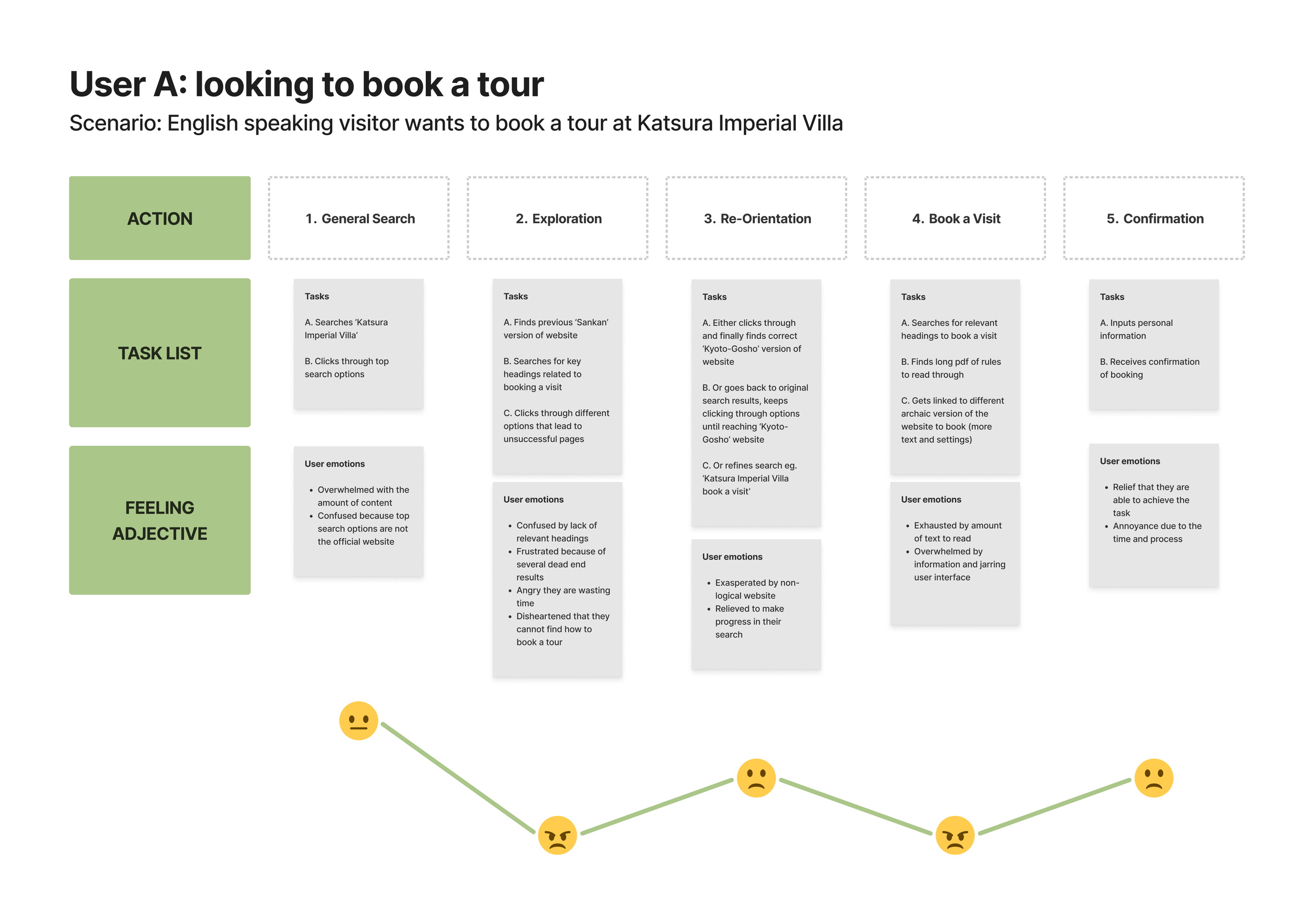
User Journey Map: Current Problems
The User Journey Map demonstrate the site’s organizational and navigational problems through one important user perspective: a user that has come to the site to book a tour at one of the four villas. This primary user group is important to consider not only because they contribute to a large portion of the website’s traffic, but also because they provide income for the business.
04 Recommendations
Revised Navigation Structure & Site Map
The Current schematic shows how the site structure has no homepage, there are many redundant in-linked pages, and most of the information is in-page content (rather than clicking links, the user must scroll down a page).
The Proposed schematic adds a homepage, a search bar to the Global Navigation, and integrates the Side Navigation Menu directly into the Global Navigation to allow for one consolidated navigation system. The in-page content is converted to linked pages that are easy to find and click from the menu bar. The Footer has also been simplified and made to resemble a typical Footer with this typology.


Wireframe Sketch: Homepage
The proposed wireframe integrates components of the previous ‘Sankan’ website with the new. The homepage features a large hero image and four clear categories in which you can click into. These four categories are echoed on the top navigation menu where the user can find a simple dropdown to quickly get an overview of where to find linked information.
A Home button is added to the top left of the top navigation menu, and a search bar is added to the right. There is also a simplified footer added to the bottom.

05 Next Steps
Creating wireframe iterations for the homepage and major secondary pages. I could further develop the wireframes following the information architecture structure of the proposed website schematic. Doing multiple quick iterations would allow me to find different combinations of designs that could be suitable for the client.
Developing a prototype. To test the user experience, I would take the wireframes and link them into a working prototype. This would allow me to identify key user experience issues before I continued developing the project into higher fidelity mockups.